Monday, April 11, 2016

Messy March Paintings Drop


March 27 2016 4"x4" on Aquabord
Available on Daily Paint Works
Hello again! This is a bit of a sloppy post, but I would like to get it out of the way so that I can move forward with more posts once again. This is a conglomerate post of several others that I began, but didn't post. A little due to time, but honestly - mostly due to matters of the mind.

So- is this all I painted in March and April so far?? Honestly, no, but not too much more.  I've created one other "decent" painting, but it was for a gift I don't want to spoil accidentally. I've also done a couple more paintings outside, a couple of abstracts that really did not work, and some planning for a larger project.

March 20 & 21, 2016 8"x10" on Claybord
A piece donated for an art auction - my largest gouache piece so far.

March 10, 2016 4"x4" on Claybord
Palette:Prussian Blue, Peacock Blue, Permanent Green Deep, Chinese Orange +W

March 9, 2016 4"x4" on Claybord
Palette:Prussian Blue, Peacock Blue, Permanent Green Deep, Chinese Orange +W
After a series of still lifes, I was itching to do some abstract work while still practicing looking from life. I took a favorite blue shirt with colors like the aurora borealis, twisted it, and painted a section paying closer attention to the colors than to representing it perfectly. A fun project that needed repeated.

March 6, 2016 ~4" x 5.5" in Watercolor Sketchbook
Palette:Prussian Blue, Chinese Orange, Yellow Ochre

A few weekend, my husband and I took our first driving trip to go hiking. It was my first trip to Missouri's mountain, Tom Sauk Mountain! I thought I'd stop to paint a couple of times, but I ended up only painting once. This might be my first little plein air study! It was a beautiful view on a beautiful day.
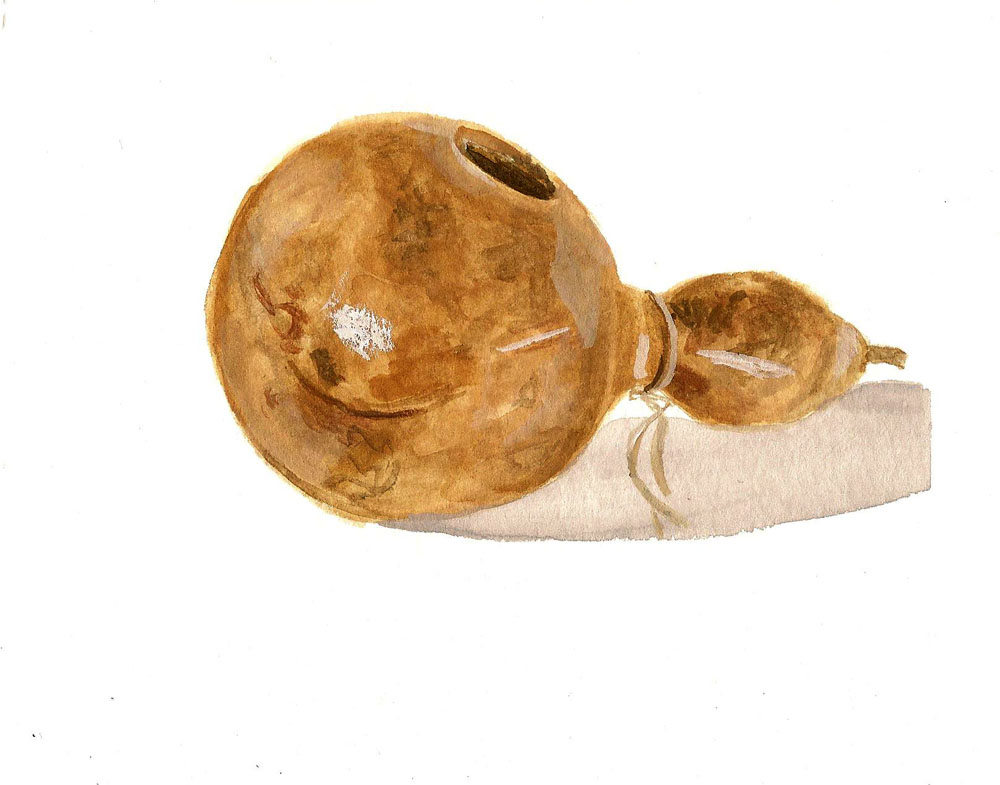
March 5, 2016 4.25"x5.5" on Watercolor Paper
Palette:Raw Umber, Burnt Sienna, B+W
March 4, 2016  4.5" x 5.5" on Watercolor Paper
Palette: Flame Red, Juane Brilliant, Ultramarine Deep, W
March 1-3, 2016 6"x8" on Claybord
Palette: Peacock Blue, Flame Red, Permanent Yellow, Yellow Ochre, B+W


Tuesday, March 1, 2016

Fuji Apples & Lillies

February 23, 2016 6"x8" on Watercolor Paper
Palette: Yellow Ochre, Terre Verte, Chinese Orange, + W

February 24, 2016 5.5"x8.5" on Watercolor Paper
Palette: Yellow Ochre, Terre Verte, Chinese Orange, Ultramarine Blue, Permanent Yellow, B + W

February 26/27, 2016 8"x6"" on Claybord
Palette: Yellow Ochre, Permanent Yellow, Prussian Blue Chinese Orange, + W

February 29, 2016 7" x 5"" on Aquabord
Palette: Yellow Ochre, Permanent Yellow, Prussian Blue Chinese Orange, + W

Tuesday, February 23, 2016

Into the Mirror

Usually, I like to begin with the post of my favorite recent painting and then give a little recap. This time, however, I feel like I need to admit something I am a little embarrassed about up front. Despite painting in oils through and after college, and despite drawing portraits often in high school, I have never painted a portrait. I've created one quick, far away figurative oil painting in my first semester of Painting 1, but then my artwork departed from representation. 

Last night I did a few sketches of the regular items - coffee mugs, tea kettle, etc. - but they weren't able to hold my attention. It was my last day of the weekend, and with a meeting scheduled for tonight I wanted to have a focused piece. So, I decided to give a self-portrait a whirl! Since I've never had to mix skin tone paint colors before, I limited my palette immediately to one of my go-tos: ultramarine deep, burnt sienna, and yellow ochre. There are a few colors I'll need to add in to the mix if I continue to do portraits, but this helped tremendously for my first go.

February 22, 2016 5.5"x8.5" on Watercolor paper
Palette: Ultramarine Deep, Burnt Sienna, Yellow Ochre,+ White
To my relief, it turned out all right! Not perfect, but a good start. There were a few areas of the skin that started to get rough, since the gouache would only let me work over it so many times. I forgot how fun it can be to paint people (even myself), so I may need to drum me up some models for the future!

Monday, February 22, 2016

Vase, Mallets, and an Obscene Shade of Orange

February 20, 2016 6"x8" on Claybord
Palette: Chinese Orange, Carmine, Terre Verte, B+W
It has been awhile since I sat down to do a larger, focused painting on claybord. (As a side note, it is strange to consider 6"x8" as large after doing 4 foot paintings for awhile.) This is a little red ceramic vase with a beautiful glaze that was really tricky to capture. It drips and swirls between white, deep red, and an almost green. I've mentioned before that painting on claybord can be a frustrating experience for me, but I loved being able to pick up the paint for colored highlights in the glaze. The bright reds were created this way, and the edges formed by the action worked with the pattern in the glaze.

I used my painting from the day before as a prep-day, and did a 20 minute gouache sketch to take a little time to consider the lighting and shape of the vase.

February 19, 2016 4"x6" on Watercolor Paper
Palette: Carmine B+W
February 21, 2016 4"x4" on Claybord
Palette: Flame Red, Juane Brilliant, Yellow Ochre, Ultramarine Deep, B+W
After a day of spring cleaning, I settled down to paint and wanted to paint something BRIGHT! I looked around my studio and my Art/Work book stood out as a good backdrop color to use. For the subject matter I decided to take my husbands advice, for the probably the first time ever when it comes to subject matter, and painted his drum mallets. My loose approach to them didn't work great when it came to the tight wrapping of the yarn, but I did enjoy mixing all of the colors. I think I might return to the mallets for a longer composition when I feel like doing some tight, detail work.

February 18, 2016 ~0.75"x1" on Watercolor Paper
Palette: Raw umber, B+W
And I suppose I should tack on my late-night painting sketch from Thursday, as well. I worked an evening event and just wanted to practice something quick! A teeny, tiny bottle did the trick. 


Kitty Cat Toys

February 16, 2016 4"x4" on Aquabord
Palette: Ultramarine Deep, Burnt Sienna, Raw Umber, B+W
The aquabord I used for this little painting was originally used for the first try of my rum composition. After realizing the painting wasn't working (maybe an hour of painting), I took it to the sink and rinsed off all the excess paint. There was still a shadow of the composition, so when I returned to use it again I decided to go with a dark subject matter. It was another evening painting, and I wanted to grab something fun that I could be looser with my brushstrokes. Since I am always tripping over little mice, I decided to paint this little guy. This gray and blue mouse is among the favorites of Copper, my younger cat, so it is often quickly lost under couches, chairs, stoves, fridges, you name it!

February 17, 2016 4"x4" on Claybord

Okay, I admit it! I've been slacking on noting my color choices. Before, I was writing the color selection down each time after I finished a painting (or before I began the next one and put my previous paints away) but I didn't do that this past week. I can't quite remember which paints I used for this carrot cat toy... I want to say lemon yellow, terre verte, juane brilliant... or it might have been lemon yellow, prussian blue, chinese red, and juane brilliant. Ah, well, it was another fun, silly still life.

Tuesday, February 16, 2016

Fast Peppers with a Rum Finish

February 10, 2016 5.5"x8.5" on Watercolor paper
Palette: Raw Umber, B+W

It  has been about a month and a half since I began my daily paintings, and a bit longer since I've begun regular painting with gouache, and I have realized more than once that I do better with flexibility. Doing a full, composed, beautiful painting every day makes me a little stressed out (and that does not translate into good artwork). So, I'm loosening my guidelines on myself. If I need to take a day off, I will. If I paint, it is okay to do a study with a specific goal in mind or a more complete painting.

For this vase of stones, the goal was a quick value study. 

February 10 & 11, 2016 5.5"x8.5" on Watercolor paper
Palette: Flame Red, Chinese Orange, Terre Verte, B+W

For my two pepper studies, the goal was to quickly capture the form of a bell pepper from angles I had not yet painted. And I mean quick! They were both completed in less than a half hour, which is always a challenge for me.

February 13, 2016 4"x4" on Claybord
Palette: Ultramarine Deep, Burnt Sienna, Yellow Ochre, B+W
This painting began with the composition for February 15th, below, but the stress I referred to above was getting to me and I kept making obvious mistakes. I couldn't focus well, so I pulled out a fresh claybord and simplified the composition. Working quicker let me knock this painting of the shot of rum out fairly quickly and happily. 

February 15, 2016 4"x4" on Aquabord
Palette: Ultramarine Deep, Burnt Sienna, Yellow Ochre, B+W

A few of the proportions of this were a bit wonky, but it was much more fun to paint the second time around. The box with the shot glass on top was tricky, as the lid is off center. I could have happily spent another three hours on just the bottle of rum. I think it is safe to say that I'll return to the bottle for a longer study!

Wednesday, February 10, 2016

Three in a Row

February 9, 2016 4"x4" on Aquabord
Palette: Ultramarine Blue, (touch of Peacock Blue), Lemon Yellow, Permanent Yellow, B+W

Lately, I have found myself losing interest in the solitary subject. Though it makes for good practice, I feel like I'm getting a hang of using gouache (except for on claybord, which is always a challenge) and will improve more by moving my focus to quick composition. Then, there is the fact that I've painted my way through most of the objects in my house that I can physically move to my studio. Do you buy produce just for still lives? For instance, I've considered buying red apples, even though I don't enjoy them as much, for a different punch of color.

This painting was one of the more enjoyable pieces to make. The laying out and twisting back and forth of the apples, the drawing, the color choices.... It all came together without too much fuss. This black vase was one of the few things I've bought specifically to paint, and I picked it up at a favorite antique/thrift store. I love the modern shape, and was originally dead-set on painting it with a solitary lemon. While I might return to that composition, I thought three little apples all in a row would work better on the square panel.